
Cold Standard
Ice cream, held to a higher standard.
Cold Standard is a self-directed ice cream brand concept built around a simple contrast: a name that sets high expectations and an identity that feels warm, playful, and approachable. I developed a visual direction spanning the logo, mascot, packaging concepts, and motion, using AI-assisted tools to explore and refine the applications.
- Project type
- Self-directed, fictional brand concept. No client.
- Role
- Concept development, visual direction, identity refinement, packaging concepts, and motion direction
- Tools
- AI image generation, local H3 animation, and authored compositing and editing
01A character at the center
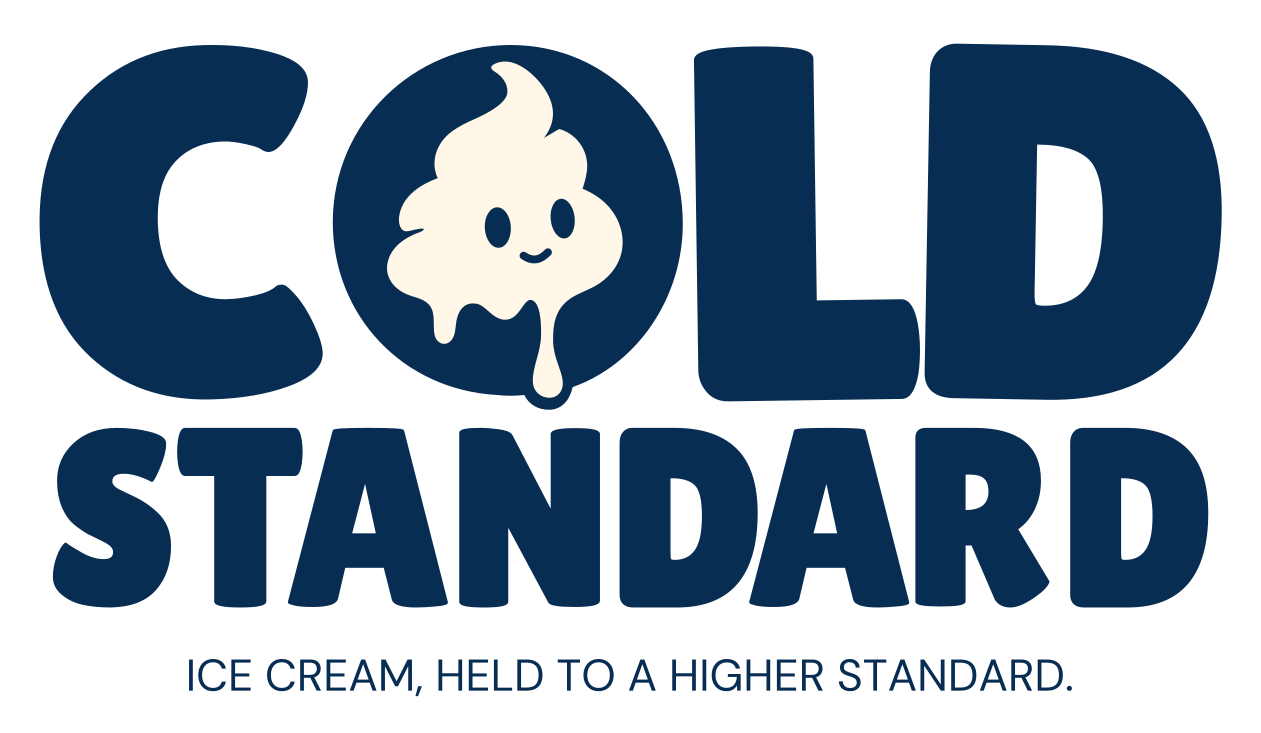
Primary logo, mascot, tagline lockup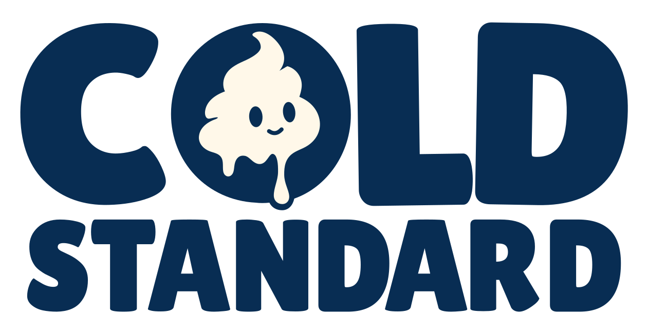

The smiling ice cream mascot sits inside the O in COLD, giving the wordmark a recognizable focal point. Compact, rounded lettering gives the name weight, while the cream silhouette and uneven drips soften its form. The same character carries through the packaging and animation.
02Brand system
Core palette, flavor accents, type- Navy
#082D53 - Cream
#FFF8E9 - Sunshine
#FFC43D
- Vanilla
Sunshine - Strawberry
#EA687C - Midnight
#B8A0D8
Good people. Lilita One for brand display, DM Sans for supporting copy.
03One identity. Three flavors.
Packaging concepts · click to enlargeNavy and cream hold the system together. Sunshine yellow identifies Vanilla Standard, pink identifies Strawberry Standard, and lavender identifies Midnight Standard, the chocolate flavor. Shared logo placement and graphic details connect the pint, sandwich wrapper, and takeaway bag concepts.
Front panels are concept artwork, not production dielines.
04A little personality in motion
Three square spots · 10 s · silent · click to playThree short, silent animations bring the character into each flavor's world: sunshine for Vanilla, pink for Strawberry, and moonlight for Midnight. A simple sandwich-building action gives each spot a shared structure, while color and small finishing gestures distinguish the flavors. Each animation ends on the approved logo and flavor title.
05The gold standard, served cold
Campaign extension · click to enlargeA visual play on the name: gold bars stand in for ice cream sandwiches, stacked like bullion under the line “The gold standard. Served cold.” The same illustration style carries into a six-flavor menu board that extends the core three with S’more, Cookie, and Mint Standard concepts.
Illustrations are AI-generated concept artwork directed and composited into outlined Lilita One and DM Sans layouts. Menu items and prices are placeholders for a fictional brand, not an offering.

06Campaign poster
Supporting concept · click to enlargeCold Standard is a fictional, self-directed brand concept. Packaging imagery and character animation are AI-assisted concept visualizations. Art direction, selection, refinement, and final presentation form part of the project. These are not photographs of manufactured products or evidence of a commercial launch.
Ethan Walsh: concept development, visual direction, identity refinement, packaging concepts, and motion direction. Tools used in the project include AI image generation, local H3 animation, and authored compositing and editing. Logo lettering carries the approved optical-spacing revision across every asset.